June 10, 2026/
Most financial analysis stops at ratios — revenue growth, margins, ROE. Those are useful, but they don’t tell you how...
The code below does the following
A copy of the jupyter notebook can be found here
The code below is the libraries used, the function to get stock data, and the ticker_list
# Import Libraries
import pandas as pd
import yfinance as yf
import matplotlib.pyplot as plt
import seaborn as sns

# Function to fetch historical stock prices
def get_stock_data(ticker, start_date, end_date):
    stock_data = yf.download(ticker, start=start_date, end=end_date)
    return stock_data

# Get Tickers
sp_df = pd.read_html('https://en.wikipedia.org/wiki/List_of_S%26P_500_companies')[0]
sp_df['Symbol'] = sp_df['Symbol'].str.replace(r'\.', '-', regex=True)
tickers_list = list(sp_df['Symbol'])[:]
# tickers_list

# Smaller Test List
# tickers_list = ['AAPL', 'MSFT', 'GOOGL']
Below are the summarizing and plotting functions
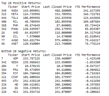
# Function to create and display a summary of returns
def summarize_returns(results_df):
# Display summary bar chart
plot_bar_chart(results_df)
plot_box_plot(results_df['YTD Performance'])
plot_histogram(results_df['YTD Performance'])
# Sort by YTD Performance in descending order for positive returns and ascending order for negative returns
positive_returns_df = results_df[results_df['YTD Performance'] > 0].sort_values(by='YTD Performance', ascending=False)
negative_returns_df = results_df[results_df['YTD Performance'] < 0].sort_values(by='YTD Performance', ascending=True)
# Display top 10 positive returns
print("Top 10 Positive Returns:")
print(positive_returns_df.head(10))
# Display bottom 10 negative returns
print("\nBottom 10 Negative Returns:")
print(negative_returns_df.tail(10))
# Function to create a bar chart of YTD returns
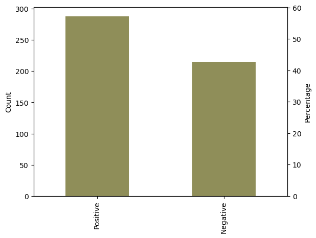
def plot_bar_chart(returns_df):
returns_sign = pd.cut(returns_df['YTD Performance'], bins=[-float('inf'), 0, float('inf')], labels=['Negative', 'Positive'])
returns_count = returns_sign.value_counts()
returns_percentage = returns_sign.value_counts(normalize=True) * 100
fig, ax = plt.subplots()
returns_count.plot(kind='bar', ax=ax)
ax.set_ylabel('Count')
ax2 = ax.twinx()
ax2.set_ylabel('Percentage')
returns_percentage.plot(kind='bar', ax=ax2, color='orange', alpha=0.5)
plt.show()
# Function to create a bubble chart of YTD returns
def plot_bubble_chart(results_df):
# Create bins for returns
bins = [-float('inf'), -10, -5, 0, 5, 10, float('inf')]
bin_labels = ['-Inf to -10%', '-10% to -5%', '-5% to 0%', '0% to 5%', '5% to 10%', '10% and above']
# Categorize returns into bins
results_df['Return Bins'] = pd.cut(results_df['YTD Performance'], bins=bins, labels=bin_labels, include_lowest=True)
# Group by return bins and count the number of companies in each bin
return_counts = results_df.groupby('Return Bins').size()
# Create a bubble chart
fig, ax = plt.subplots(figsize=(10, 6))
scatter = ax.scatter(return_counts.index, [1] * len(return_counts), s=return_counts.values * 10, alpha=0.5)
# Add labels and title
ax.set_xlabel('Return Bins')
ax.set_title('Bubble Chart of YTD Returns')
# Add a legend
legend_labels = [f'{bin_label}: {count}' for bin_label, count in zip(return_counts.index, return_counts.values)]
ax.legend(legend_labels, title='Return Range', loc='upper right', bbox_to_anchor=(1.3, 1))
plt.show()
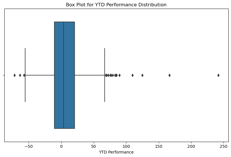
# Function to create a box plot of YTD Perf
def plot_box_plot(ytd_performance):
plt.figure(figsize=(10, 6))
sns.boxplot(x=ytd_performance)
plt.title('Box Plot for YTD Performance Distribution')
plt.show()
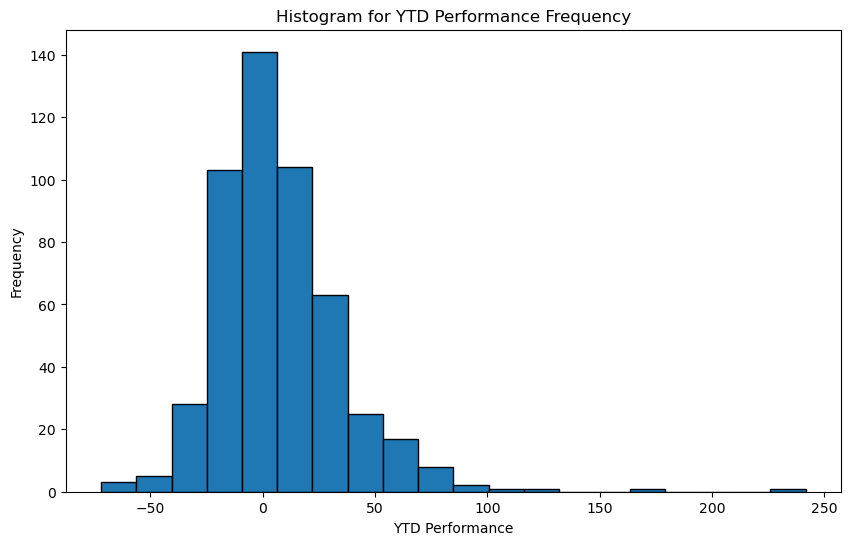
# Function to create a histogram for YTD performance frequency
def plot_histogram(ytd_performance):
plt.figure(figsize=(10, 6))
plt.hist(ytd_performance, bins=20, edgecolor='black')
plt.title('Histogram for YTD Performance Frequency')
plt.xlabel('YTD Performance')
plt.ylabel('Frequency')
plt.show()And the code to run this all
results_df = pd.DataFrame(columns=['Ticker', 'Start Price', 'Last Closed Price', 'YTD Performance'])

# Create an empty list to store individual DataFrames for each company
dfs = []

# Loop through each company, fetch YTD performance, and store the results
for ticker in tickers_list:
    stock_data = get_stock_data(ticker, '2023-01-01', '2023-11-16')

    start_price = stock_data['Adj Close'].iloc[0]
    last_closed_price = stock_data['Adj Close'].iloc[-1]
    ytd_performance = (last_closed_price / start_price - 1) * 100

    # Create a DataFrame for each company
    df = pd.DataFrame({
        'Ticker': [ticker],
        'Start Price': [start_price],
        'Last Closed Price': [last_closed_price],
        'YTD Performance': [ytd_performance]
    })

    # Append the DataFrame to the list
    dfs.append(df)

# Concatenate all DataFrames into a single DataFrame
results_df = pd.concat(dfs, ignore_index=True)

# Sort the DataFrame by YTD Performance
results_df = results_df.sort_values(by='YTD Performance', ascending=False)

# Create and display the summary
results_df = results_df.sort_values(by='YTD Performance', ascending=False)

# Call the plotting functions and summarize returns
summarize_returns(results_df)
Resulting summary will look like this